Introduction to Muze
What is Muze?
Muze is a powerful data visualization library that implements the Layered Grammar of Graphics concept to create composable and interactive charts in JavaScript.
- Composable Architecture: Build custom charts by combining different chart types
- Data-Driven: Powered by DataModel for data transformation and manipulation
- Interactive: Rich interactivity and customizable behaviors
- Responsive: Works seamlessly across desktop, tablet, and mobile devices
Core Concepts
DataModel as the data source
Muze uses DataModel as its foundation for data handling. The DataModel:
- Serves as the data source
- Provides operators for data transformation
- Powers interactivity and side effects
- Enables behavior and interaction customization
Grammar of Graphics based approach
Muze transforms data into visualizations through:
- Encodings: Mapping DataModel fields to visual properties
- Layers: Combining data with marks for visual representation
- Planar Encodings: X-axes, Y-axes, and facets
- Retinal Encodings: Color, shape, and size
Basic Components
Env (Environment)
The Environment component serves as the configuration container for your visualizations.
const { env } = viz;
Canvas
Canvas acts as the logical container for your visualization, managing:
- Axes
- Plots
- Titles
- Legends
const { muze, getDataFromSearchQuery, env } = viz;

const data = getDataFromSearchQuery();

muze.canvas()
  .rows()
  .columns()
  .data(data)
  .mount("#chart");
Layers
Layers are the building blocks of visualizations in Muze. Each layer combines:
- Data subset
- Mark type (e.g., bar, line, area)
muze.canvas()
  .rows()
  .columns()
  .layers([
    { mark: 'bar' },
    { mark: 'line' }
  ])
  .data(data)
  .mount("#chart");
Layers render in the order specified in the array, with later layers appearing on top of earlier ones.
Data Organization
Rows and Columns

Working with Rows
Rows define the y-axis and vertical facets of your visualization.
muze.canvas()
  .rows(['Miles_per_Gallon'])
  .columns(['Year'])
  .layers([
    { mark: 'bar' },
    { mark: 'line' }
  ])
  .data(data)
  .mount("#chart");
Advanced Row Configurations:
- Single field: Creates y-axis
- Multiple fields:
- Measures become y-axes
- Dimensions create facets
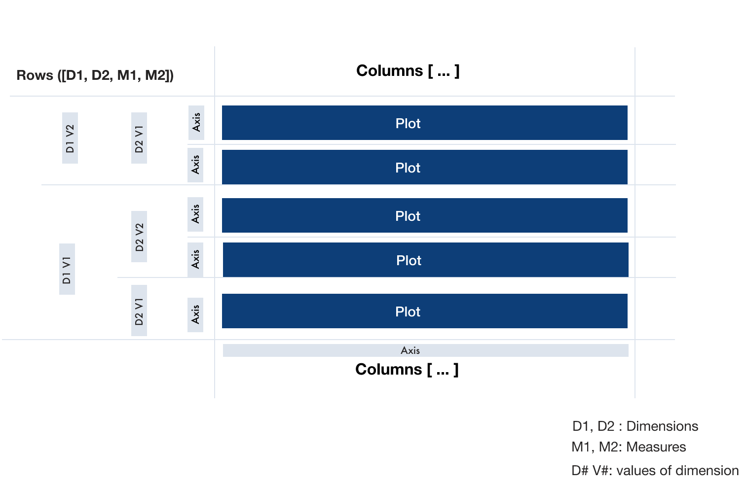
Working with Columns
Columns control the x-axis and horizontal facets of your visualization.
muze.canvas()
  .columns(['Origin', 'Year'])
  .rows(['Horsepower'])
  .layers([
    { mark: 'bar' },
    { mark: 'line' }
  ])
  .data(data)
  .mount("#chart");
When using multiple dimensions in columns, Muze automatically splits the visualization based on dimension values, creating a coordinated set of visualizations.