Introduction to Area Layer
What is a area layer?
An area layer is similar to a line chart, except that it shows the volume of a measure by area covered under the graph.
Line and area charts are very similar. While line shows trends over time, area shows change of volume. Both are measured across time. Mapping a measure (quantitative) field and a temporal (date/time) field with area mark gives us an area chart.
Example
const { muze, getDataFromSearchQuery } = viz;

const data = getDataFromSearchQuery();

muze
  .canvas()
  .rows(["Acceleration"])
  .columns(["Year"])
  .layers([
    {
      mark: "area",
    },
  ])
  .data(data)
  .mount("#chart");
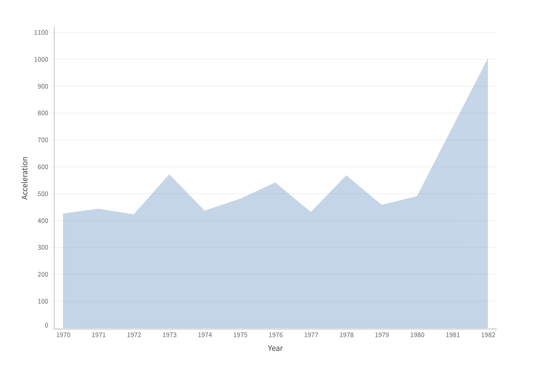
NOTE: Area chart is smooth, unlike the line plot. This is because we have add an interpolator catMullRom in layer to introduce the smoothness.
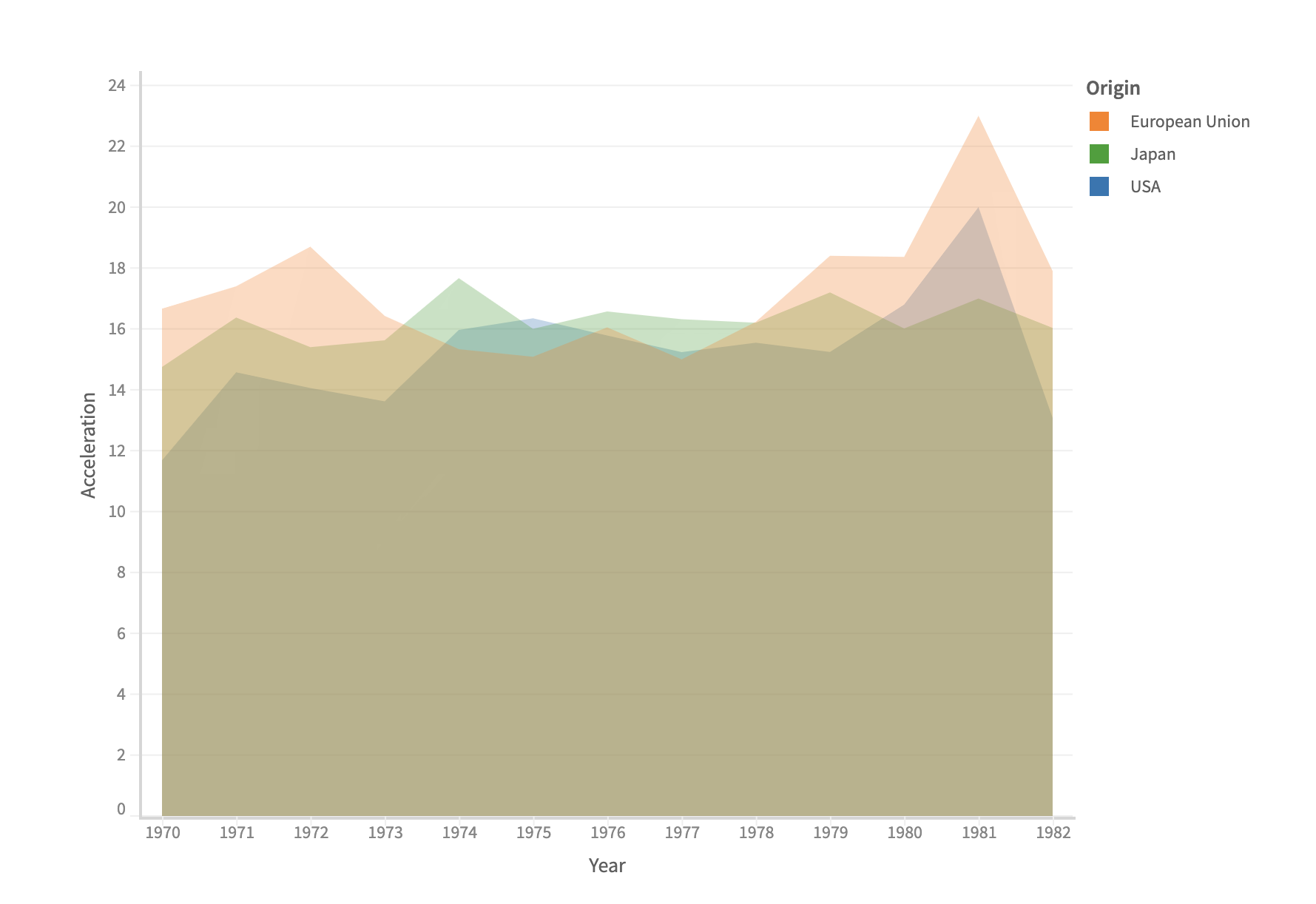
Creating a multi-series area chart
Adding a color field to an area chart gives us a multi-series area chart.
Example
const { muze, getDataFromSearchQuery } = viz;

const data = getDataFromSearchQuery();

muze
  .canvas()
  .rows(["Acceleration"])
  .columns(["Year"])
  .color("Origin")
  .layers([
    {
      mark: "area",
    },
  ])
  .data(data)
  .mount("#chart");
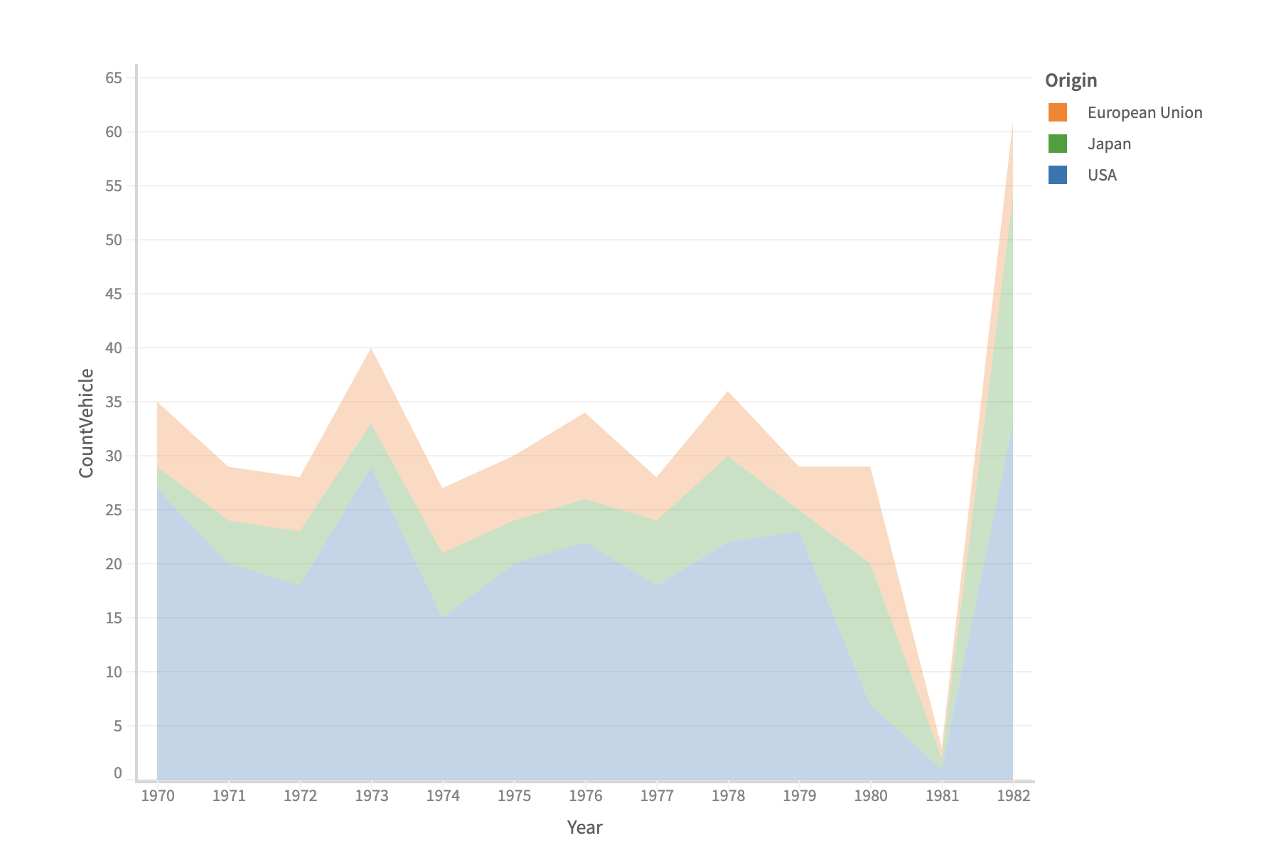
Creating a stacked area chart
Adding on to the previous chart, specifying a transform type stack produces a stacked area chart.
Example
const { muze, getDataFromSearchQuery } = viz;

const data = getDataFromSearchQuery();

let dm = new DataModel(data);
const dmWithCount = dm.calculateVariable(
  {
    name: "CountVehicle",
    type: "measure",
    defAggFn: "count", // When ever aggregation happens, it counts the number of elements in the bin
    numberFormat: (val) => parseInt(val, 10),
  },
  ["Name"],
  () => 1,
);

muze
  .canvas()
  .rows(["CountVehicle"])
  .columns(["Year"])
  .color("Origin")
  .layers([
    {
      mark: "area",
      transform: {
        type: "stack",
      },
    },
  ])
  .data(dmWithCount)
  .mount("#chart");
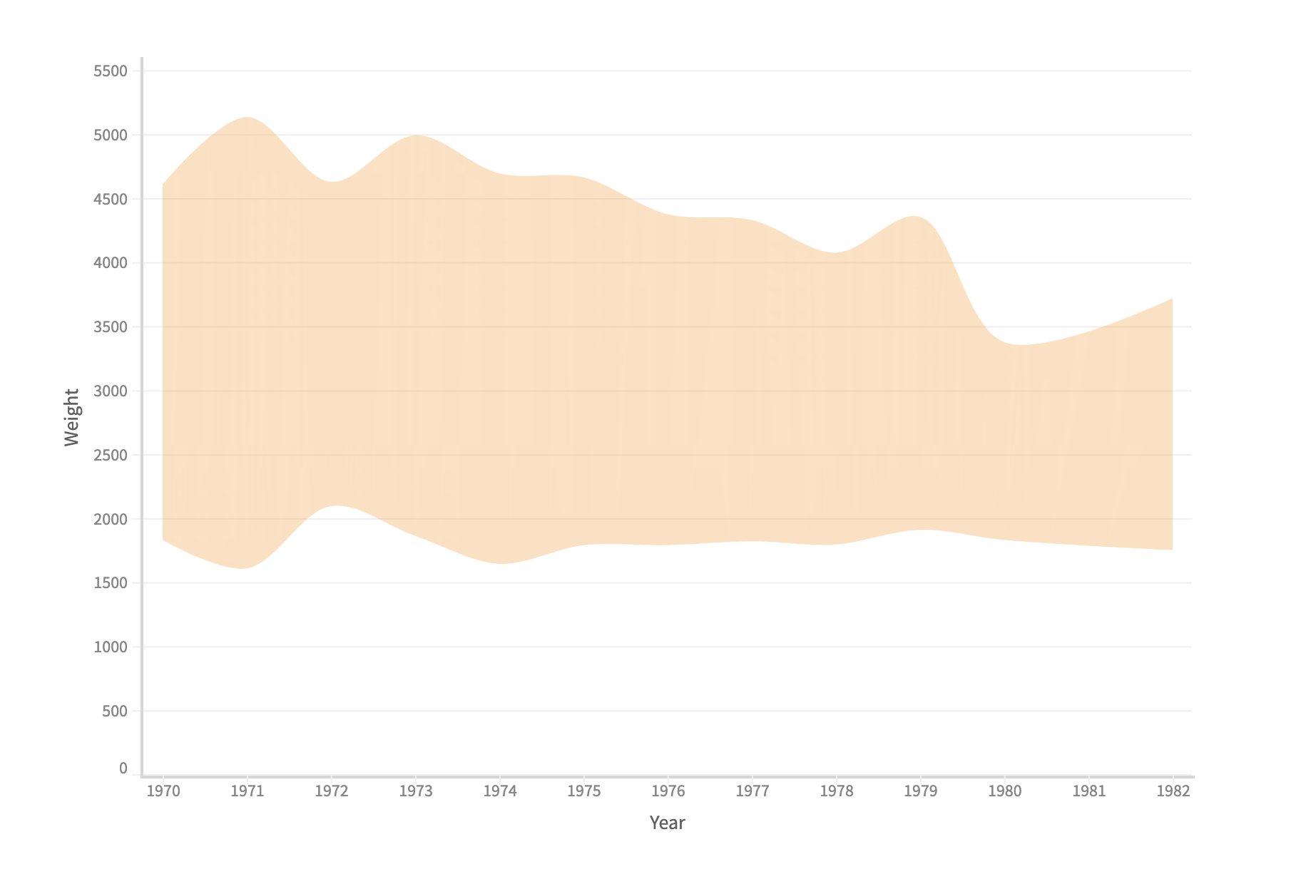
Creating a range area chart
To create an area range chart, we create two fields (min weight with min aggregation and max weight with max aggregation) plot both in y-axis using the share operator. Also we specify the min and max weights as y0 and y encoding respectively.
This creates a vertical range area chart.
Example
const { muze, getDataFromSearchQuery } = viz;

const data = getDataFromSearchQuery();

let dm = new DataModel(data);
const share = muze.Operators.share;

// Min value of weight for a group
dm = dm.calculateVariable(
  {
    name: "Min Weight",
    type: "measure",
    defAggFn: "min",
  },
  ["Weight_in_lbs"],
  (val) => val,
);

// Max value of weight for a group
dm = dm.calculateVariable(
  {
    name: "Max Weight",
    type: "measure",
    defAggFn: "max",
  },
  ["Weight_in_lbs"],
  (val) => val,
);

muze
  .canvas()
  .rows([share("Max Weight", "Min Weight")])
  .columns(["Year"])
  .layers([
    {
      mark: "area",
      encoding: {
        y: "Max Weight",
        y0: "Min Weight",
        color: { value: () => "#ff9800" },
      },
      interpolate: "catmullRom",
    },
  ])
  .config({
    axes: {
      y: {
        name: "Weight",
      },
    },
  })
  .data(dm)
  .mount("#chart");